Fonts and Writings
 All films have introductory and conclusive title sequences, on top of this, titles used throughout the film. These are used to show us the variety of people and production groups that assisted in producing the film. Also, occasional titles appear within the film to depict certain aspects to us such as location or character details. However, these writings simply cannot be placed randomly on the screen, they must have some structure and appeal to the way they are presented to us. The way the writings are depicted through font, size and colour help reinforce the way atmosphere and character is created in the film, whether it be a colourful and funky writing or a bland, simple one can have a lot of impact on the audiences thoughts about the film.
The Passengers (2016)
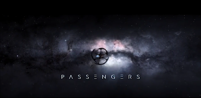
The opening title immediately infers to the audience that this film is indeed a science fiction film. The letters look very modern and different and the general font is very tidy and clean.
Furthermore, general details about the opening scene are in the same font style - very clean, white and modern looking.

Full Opening Scene
This font is also used extensively throughout the credit scene, in which it contains the details of production, which is usually shown in the opening scene.
Full Ending Scene
The Girl with the Dragon Tattoo (2011)
 The title to the film has the phrase 'Dragon' in it. Naturally we associate dragons to be ancient and mythical creatures that have merely been conveyed in myths or fictional texts, as they aren't real. To compensate for this title the opening font has been altered, in that it has been given a small leading effect, in that the letters slowly carry on as if they had been written. This gives them a more ancient look.
Full Opening Sequence
Captain America: The Winter Soldier (2014)
This movie is part of the massive Marvel franchise and Marvel began as comic books in 1939. Now, it has grown into the massive and popular film series that we know today in the 21st Century. Due to this, the opening to this film has a comic book theme, this being simple colours and shapes to relate to the how Marvel originally began in 1939. However, the font is therefore also very simple, just like a comic book.
Full Opening Sequence


No comments:
Post a Comment